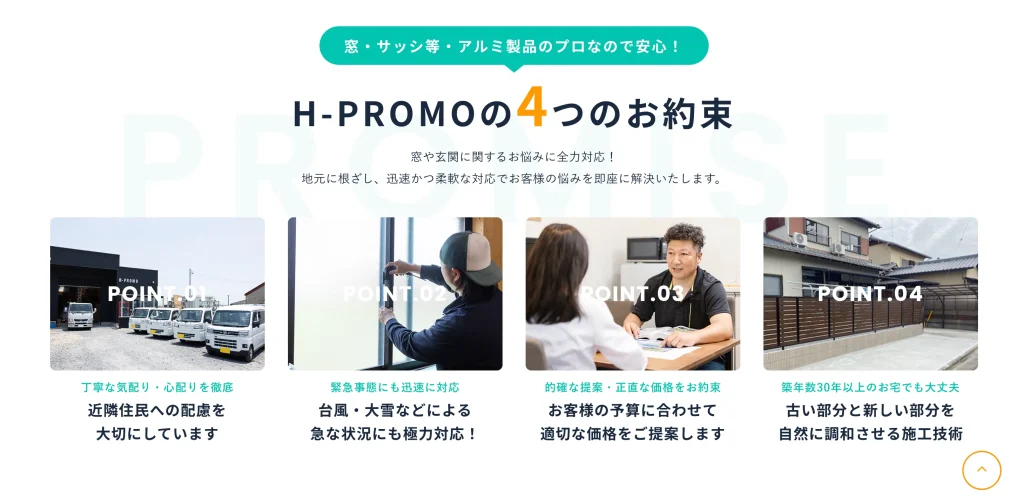
特徴・選ばれる理由 2026 2/25 特徴・選ばれる理由 見出し・サブタイトル ベタ塗りの吹き出しを配置することで、白背景とのコントラストが生まれ、最初の視線の止まりどころになっている。タイトル内の「4」をサイズ・色で強調し、情報の優先順位を明確化している。ユーザーは“一瞬で内容が4項目だ”と理解でき、下のカードへ自然に視線が流れる。→最初の視線の止まりどころとして、ベタ塗りのアイコンや吹き出しは効果的。 特徴・選ばれる理由 見出し・サブタイトル Let's share this post ! Copied the URL ! Copied the URL ! サービス一覧 お問い合わせ Author of this article orion_admin 関連記事 特徴・選ばれる理由 2026年2月23日 あいさつ・〇〇について 2026年2月16日 見出し・サブタイトル 2026年2月11日 Comments To comment Cancel replyComment * Name * Email * Website Save my name, email, and website in this browser for the next time I comment.
Comments